recover. renew.
repeat. rebrand.
pioneer in the
circular economy.
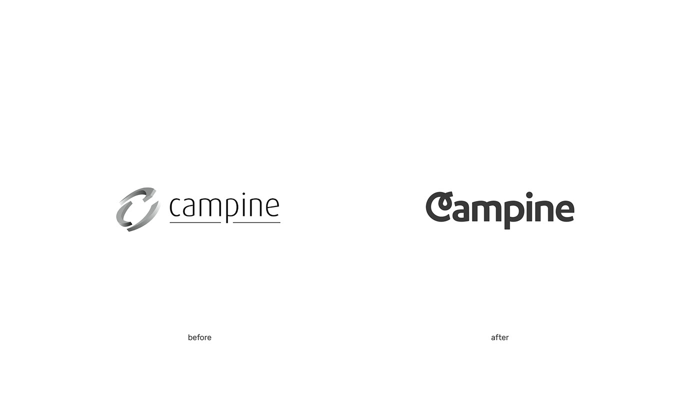
Campine has been a pioneer in the recycling of waste materials and the creation of new raw materials for over 100 years. After that century of existence, and with the arrival of a new CEO, the choice was made to have the brand completely renewed. A freshly formulated mission and vision were the starting point for skinn to distil a clear brand strategy and to merge the purified core elements into a single, solid brand concept.
strategy as fuel
for innovation.
Throughout Campine’s 100-year history, a gap developed between the brand’s identity and the outside world’s perception of it. Together with the recycling company, we built a stronger brand awareness, more brand recognition, and a positive image both internally and externally. Reducing the distance between brand identity and brand image was central to the development of a sophisticated communication strategy and style.

merging into
a brand concept.
With its resolute decision to protect people and the environment, Campine has a sustainable story to tell that cannot be left untold. The new brand image had to be fresh, dynamic, and striking with a warm, human touch.
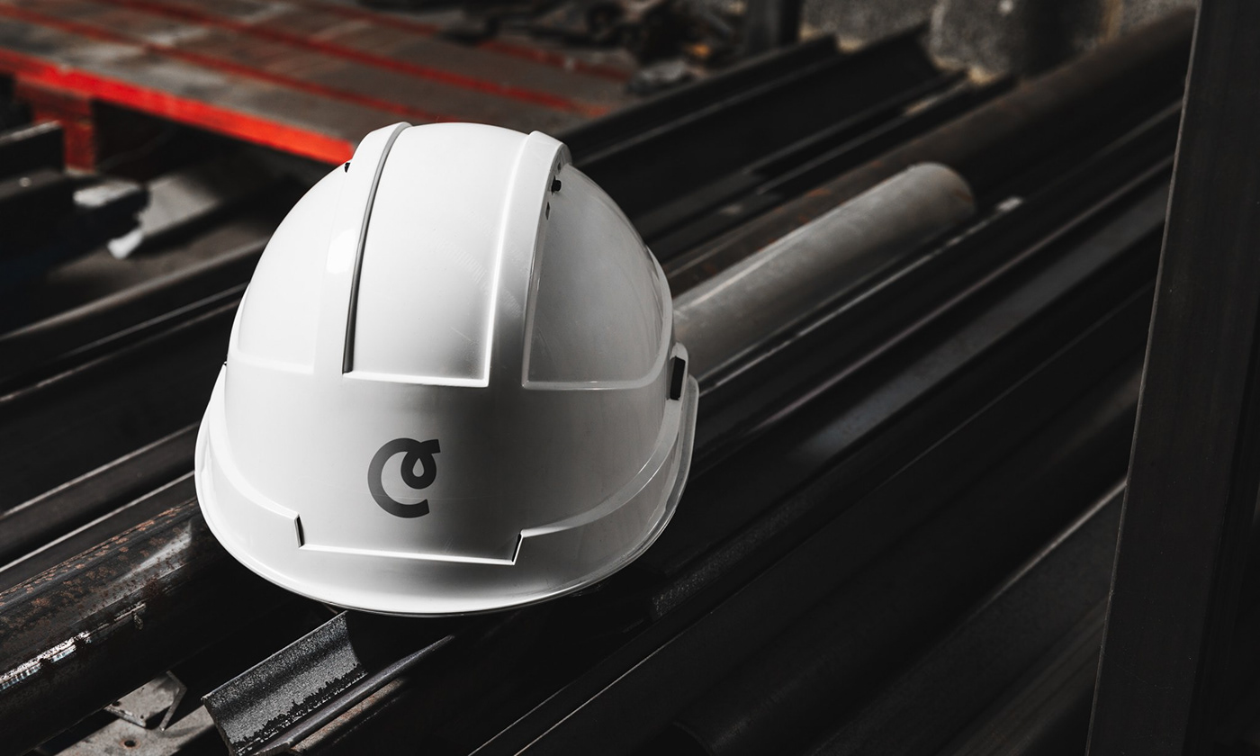
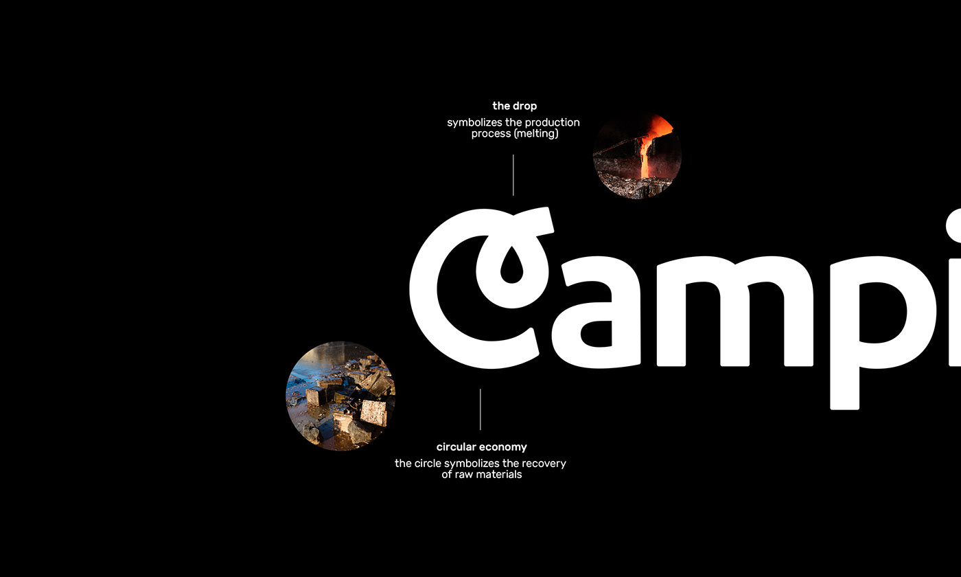
When defining the brand concept, we started from the activities and melting processes of Campine. The colour palette we selected and the gradient we used reflect the glow and warmth of the combustion process, while the logo symbolises the operation of the circular economy.


imagery with a warm,
human touch.
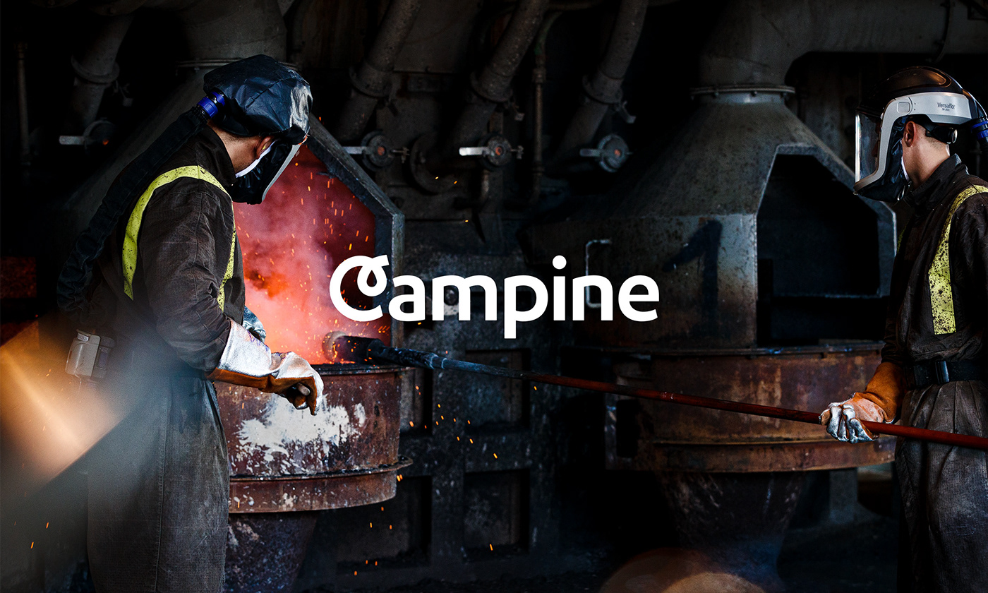
When creating the brand framework, it is necessary to define a suitable image style. In collaboration with Kurt Anthierens (photography) and Charles Pacqué (video & editing), a series of images were made that strengthen the brand feeling.
The visual style we developed is spontaneous, human, and authentic. We provide a traditional picture of the activities and employees at the recycling company. In addition to the production on the company’s premises, we also look for the landscaping around it. By showing details of processes, products, and applications, we provide an insight into Campine’s impressive operation.


from concept
to framework.
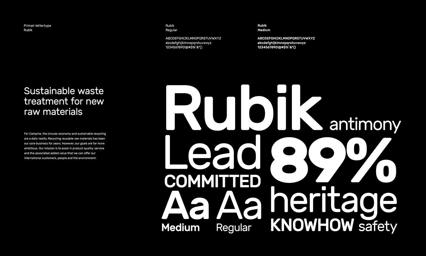
The craft-inspired brand concept was expertly transformed into a single, strong brand framework in the form of clear guidelines and tools to allow all the different communication media to emerge from it.
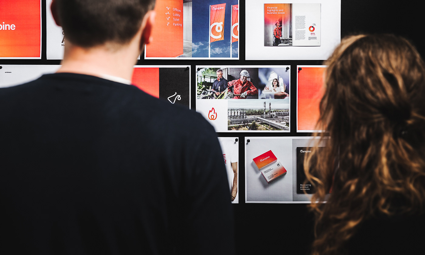
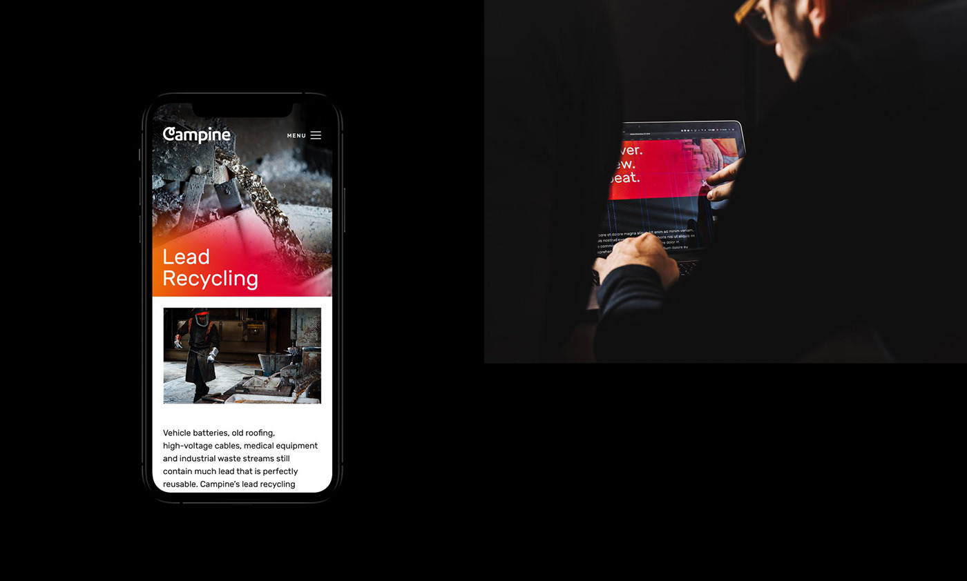
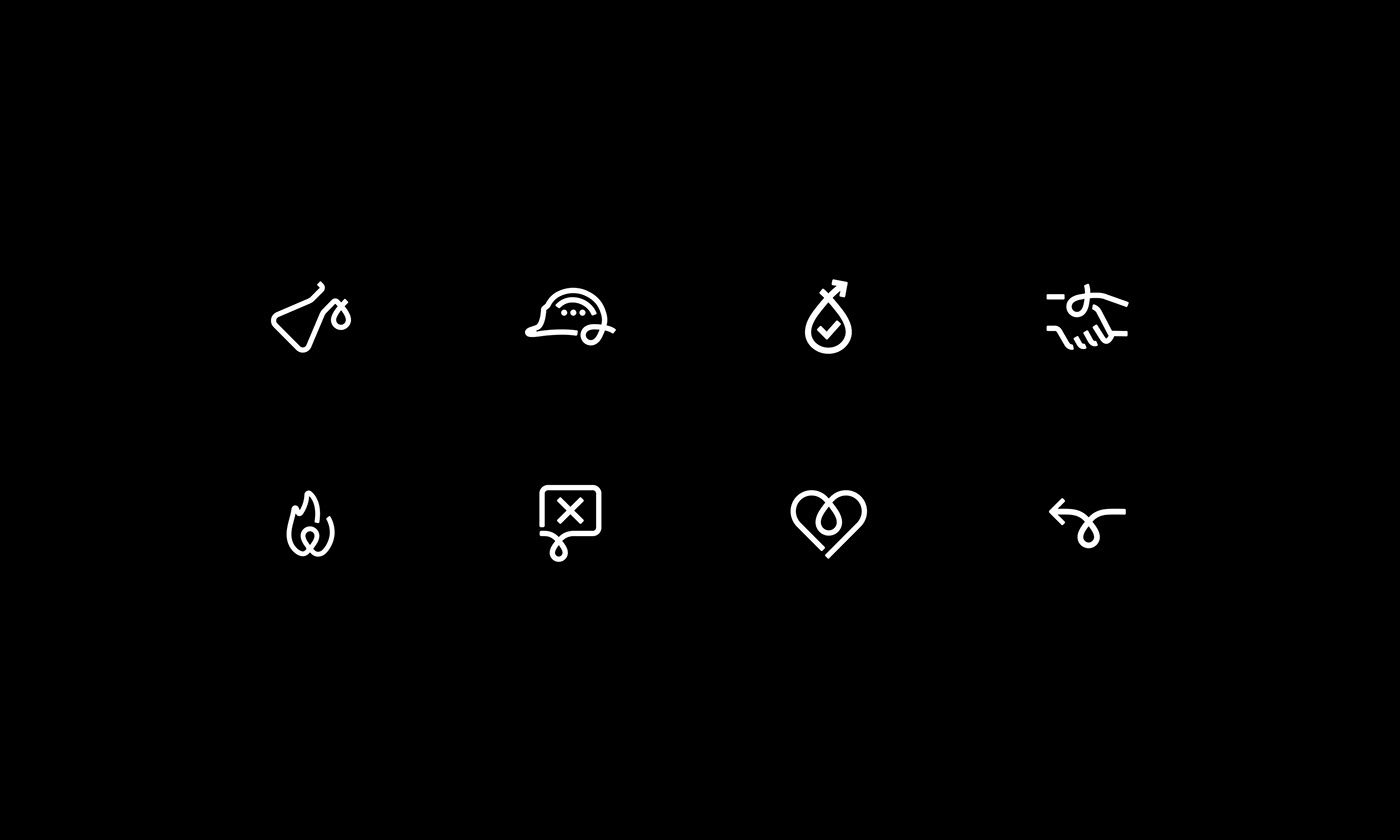
Based on the framework, a rich assortment of physical and digital tools were designed, ranging from stationary to annual reports and from web design to motion style. For the development of the accompanying illustration style, the logo emblem was always used as the starting point, in order to align all the graphic elements.


branding for a
sustainable future.
As a pioneer in the sector, Campine is actively contributing to the circular economy with the recovery of reusable raw materials. Inspired by the ambitions of the company, we were encouraged to build a sustainable brand with a timeless feel and a warm authentic touch.